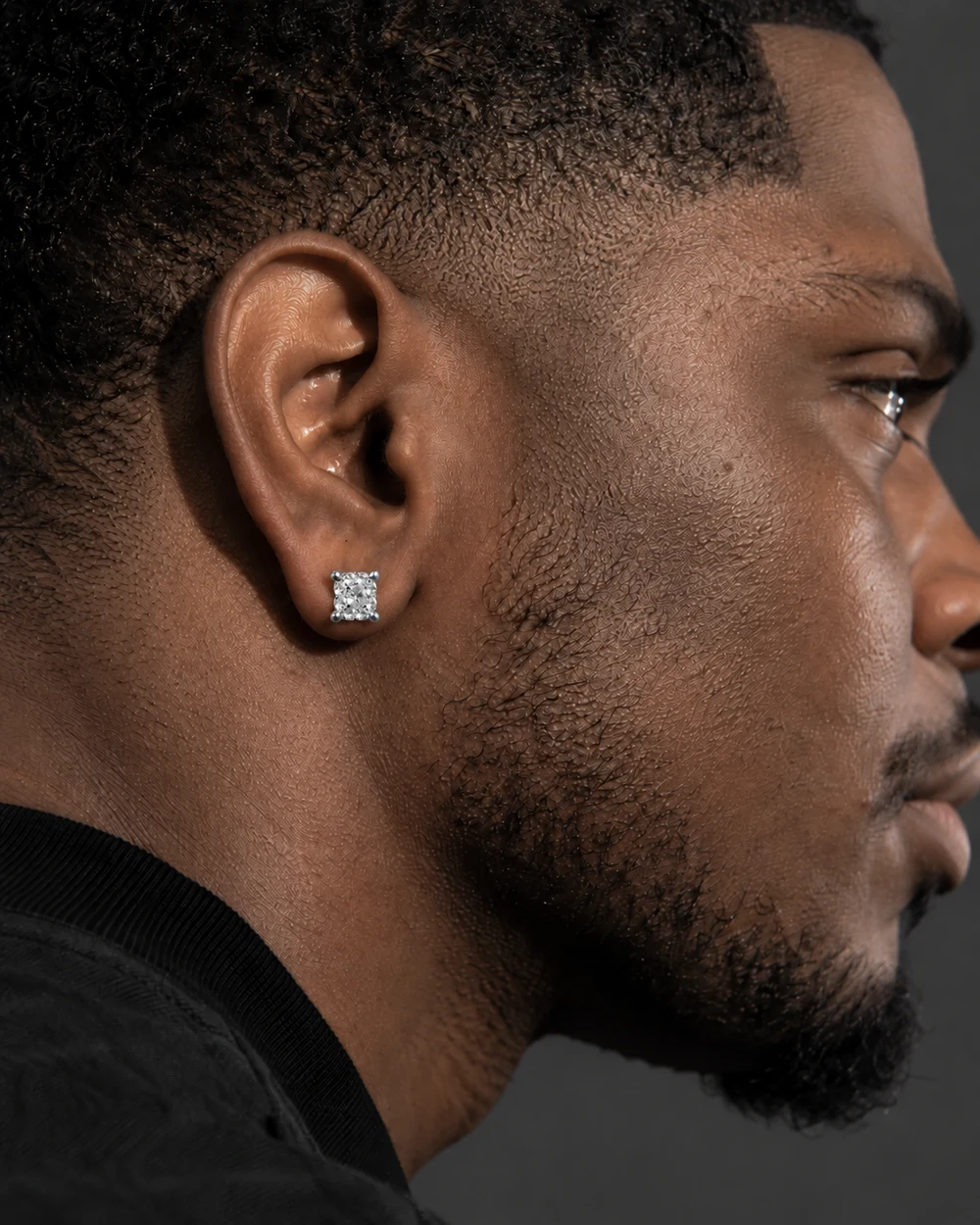
Start with contrast.
Silver-tone jewelry and a dark outfit make an easy starting point. Black, charcoal and deep blue give the eye a quiet background, so the outline of the jewelry can stand out.
For a lighter look, try white or a pale neutral. The result feels more tonal, with texture doing more of the visual work. Neither direction needs a complicated stack.
Repeat a shape, not every detail.
A straight-edged ring can sit alongside a simple bracelet without matching it exactly. Look for one visual connection, then leave some variation in scale or texture.
If the overall look feels busy, take a piece away. The goal is a combination you enjoy wearing, with each element given enough space.
Colour is a starting point.
Use the silver tone as a styling cue, then read the material and option information on the individual product page. A colour in an editorial photograph is not a material specification.
Check the selected metal, size and other options before adding the piece to your bag. The fit guide is a useful next stop when you are deciding how the piece should sit.